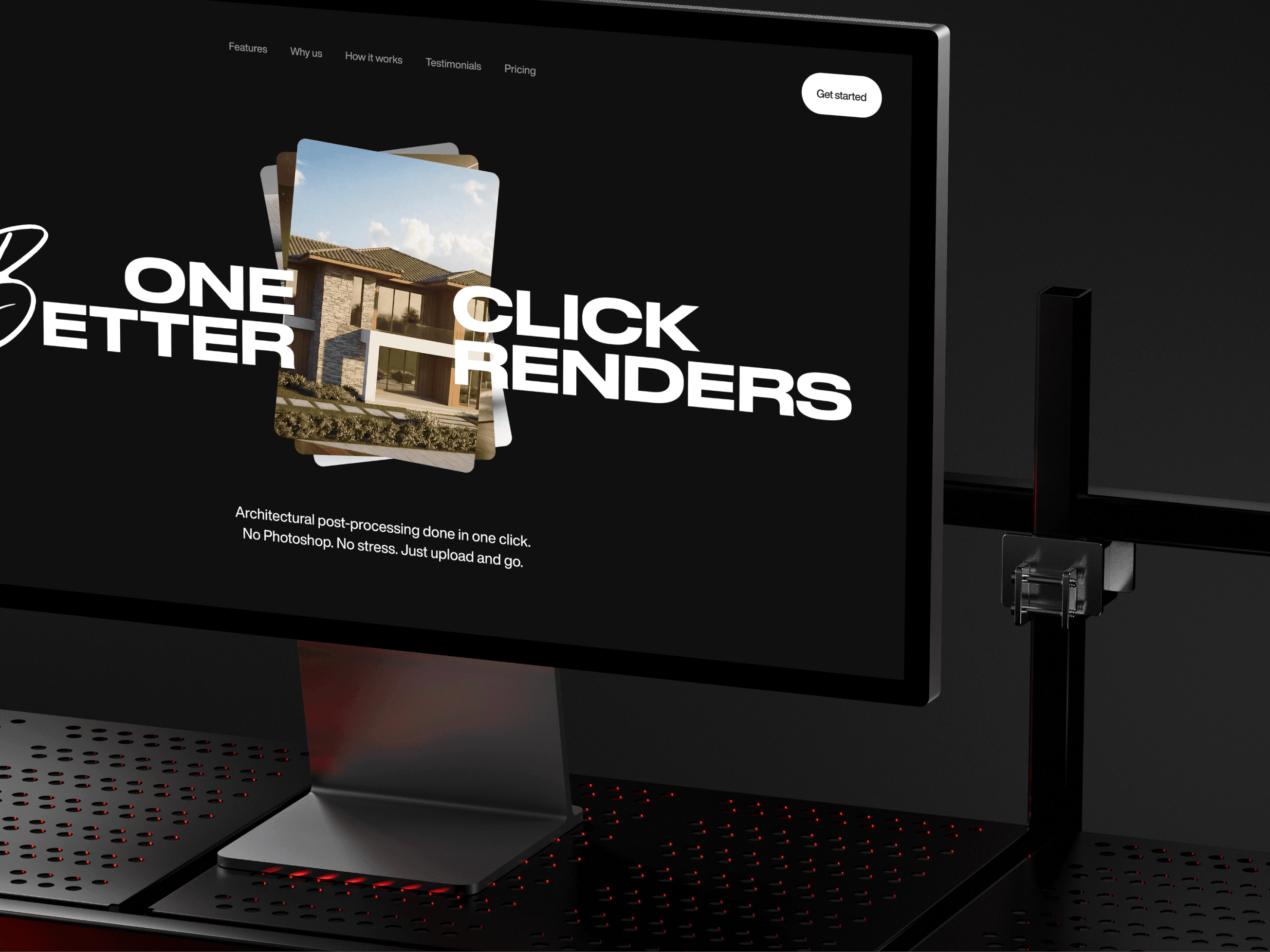
Cutting time-to-first-value from 10 to 3 minutes for a cloud workstation platform
Client
Cloud-GPU startup
Year
2024
Role. Lead Product Designer — solo for the first 3 months, then leading a design team of 5 (2 junior, 3 mid-level)
Team. 6 designers (incl. me), 1 PM, 4 engineers, 1 DevOps
Duration. 7 months (Jun 2024 – Dec 2024)
Stage at start. Working prototype, ~12 closed-beta users
Scope of Work
TL;DR
A GPU-streaming startup wanted to let people run pro creative and engineering apps from a browser, without owning a workstation. The technology worked. The product didn't: only ~22% of trial users ever reached a successful first session. I owned the redesign of the path from sign-up to first productive minute.
Seven months later:
Activation (sign-up → first successful session): 22% → 45%
Time-to-First-Value: ~10 min → 2 min 50 sec (median)
D30 retention: 18% → 32%
Paid conversion: 3% → 8%
Voluntary churn: 9% → 4.5%
NPS: +36 (n = 212, measured at month 6 via Delighted — we had no pre-redesign baseline)
Context
GPU compute has dropped enough to make cloud workstations viable — but every existing product was built for IT admins, not creators. Setup took 30+ minutes. Pricing was opaque. Sessions failed silently. Meanwhile, a freelance 3D artist still needed $2,500+ in hardware to start working, and lost a week of income the day their machine broke.
The team had proprietary streaming tech and a GPU compute deal. What they didn't have was a product an early-career freelancer could open and use without reading docs.

Research
Three streams, run in parallel over six weeks:
14 user interviews — 5 working professionals, 4 freelancers, 3 students, 2 hobbyists. Recruited through Reddit (r/3Dmodeling, r/cad, r/videoediting) and our closed beta.
6 moderated usability sessions on the existing prototype, measuring time-to-task and verbatim friction.
Forum audit — 230+ Reddit, Discord, and HN threads about cloud workstations, remote desktop, and "my laptop can't handle X." Coded into recurring themes.
Three patterns surfaced everywhere:
Hardware is a tax on entry. One interviewee: "I priced a workstation, then bought a used car instead." Pro tools often cost less than the machines to run them.
Platform lock-in is invisible until it bites. 7 of 14 interviewees had lost a paid gig because their software was Windows-only and they were on Mac or Chromebook.
Existing cloud solutions punish casual use. The prototype dropped users onto an empty Windows desktop with no apps installed. 8 of 12 usability participants couldn't figure out what to do within 90 seconds.
Who we built for
I mapped five candidate segments and narrowed to two primary for v1.
Early-Career Freelancer. Highest pain, willing to pay $20–40/month to avoid a $2,500 purchase. Decision is emotional, not budgetary.
Working Professional. Highest ARPU, slower to switch. We won them with two features they raised in nearly every interview: pause-without-billing, and reliable file sync.
Students, hobbyists, and digital nomads stayed in messaging but didn't drive v1 product decisions. Treating them as primary would have meant five different onboarding flows — which is exactly what the prototype already had, and exactly why activation was broken.
Where we fit in the landscape
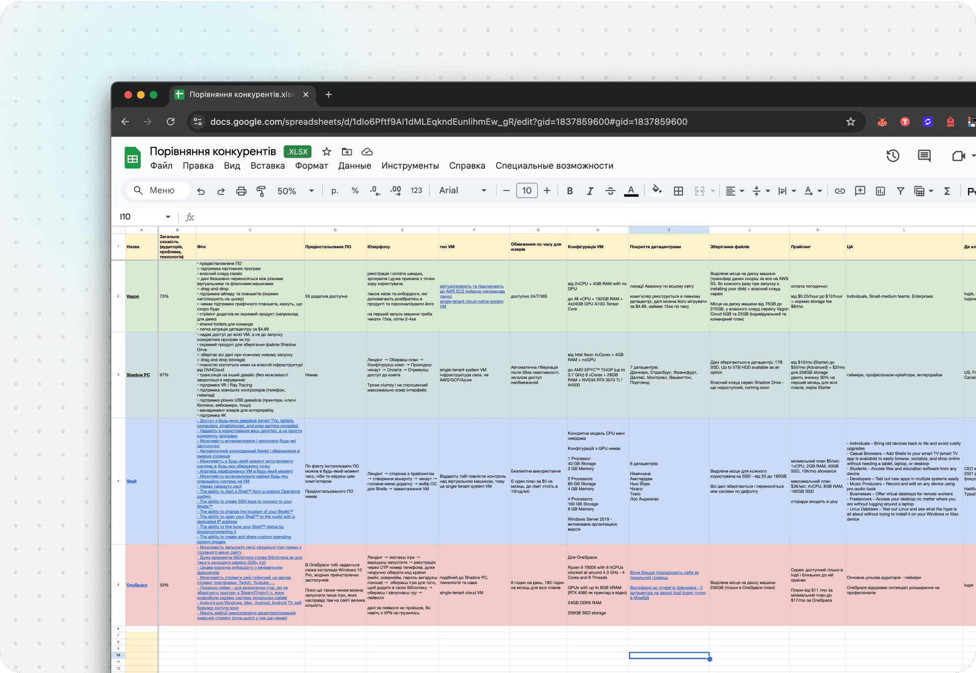
DaaS products (Shadow, Paperspace) were built for IT admins and gamers, not working creators. Remote-into-your-own-machine still required owning the hardware. Mobile workstation laptops were expensive and tethered. Raw cloud compute (AWS/Azure) had no user-friendly layer. The gap: nothing was simple, predictable, and dependable at once.
Design decisions that moved the needle
Pre-configured work scenes instead of an empty desktop
The prototype handed users a blank Windows desktop and told them to install their own software. Correct for IT admins. Hostile to creators.
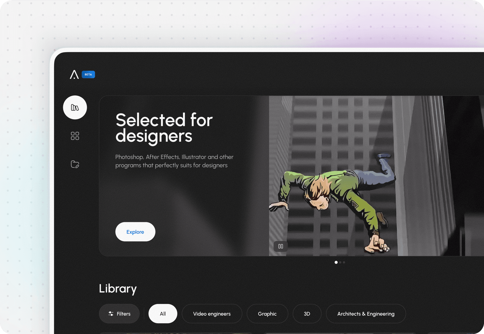
I designed an AppCard catalog with six ready-made scenes — Video Edit, CAD, 3D, Photo, Data Science, Dev — each pre-installed, with sensible defaults and the expected $/hour cost shown on the card. Twenty seconds from catalog to a loading session, instead of four minutes of hunting for installers.
Result: TTV ~6:30 → ~2:50 (median). The single biggest design contribution to the activation lift.
Session widget with pause-without-billing
Every interview surfaced the same anxiety: "What if I leave it running overnight and get a $400 bill?" Cloud pricing is the dark forest of consumer tech.
I designed a persistent session toolbar with live FPS, latency, current session cost, and a one-click Save & Pause that stops billing but keeps state. Users could close their laptop without losing work or money.
Result: Pause became the most-clicked control after "launch." Billing-complaint tickets dropped ~70% over the following quarter.
One-step onboarding with a background network check
The prototype front-loaded a three-step wizard: account, hardware check, preferences. Our experiment data (see Experiments, #1) showed one-step onboarding lifted activation but cost D7 retention — users were activating without understanding what they'd signed up for.
The shipped compromise: one visible step, with the network check running in the background and surfacing only when it found a problem — plus a short "what happens next" state while the scene loads.
Result: onboarding time fell from ~2:30 to ~40 sec, and we kept the +12 p.p. activation lift of one-step sign-up without the D7 retention cost.
Design system
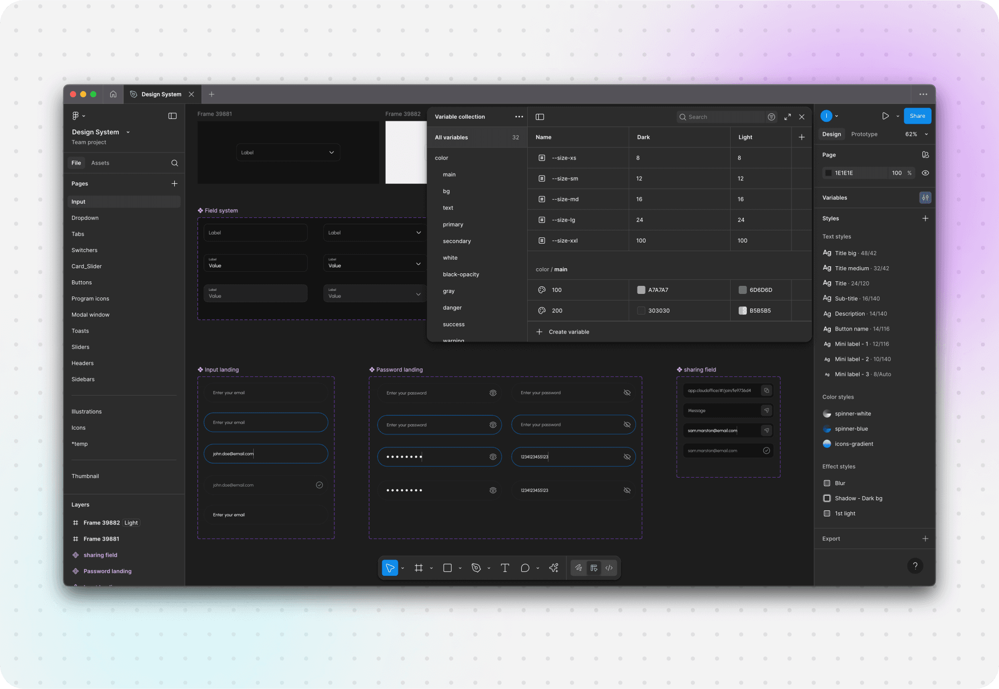
By month four, five designers had joined what had been a one-person design function — and they were shipping into the same product in three diverging visual directions. The system I built on top of the brand foundations — tokens for color, typography, spacing, network states, and session states — reached 48 components by the end of the engagement.
The number that matters isn't 48. It's this:
Two weeks after the system landed, both junior designers were shipping production features without my review. Spec-to-staging cycle time dropped from ~9 days to ~3 days across Q3–Q4 2024 — 18 features shipped in that window.
Dark mode, WCAG AA contrast, full keyboard navigation, and visible focus states went into v1, not v2. People live in this product for 4+ hours at a time.
The brand foundations came first: a visual language built for dark, long-session use — the tokens grew out of it rather than being retrofitted.

Experiments
By September, paid acquisition — Reddit ads and YouTube sponsorships in creator niches — was bringing ~900 sign-ups per week, enough to run properly powered tests. Four worth writing about. All A/B in GrowthBook, n > 1,500 per arm unless noted.
One-step vs three-step onboarding. Hypothesis: fewer steps lifts activation. Result: one-step won activation by +12 p.p., but D7 retention dropped 4 p.p. — users were activating without understanding what they signed up for. Shipped: one-step with a background network check (see decision #3).
Shipped: one-step with progressive disclosure of the network check.Ready presets vs custom build. Half the room — and every pro we'd interviewed — wanted custom configuration as the default. I disagreed, but didn't argue: we tested. Presets won first-session success in every segment, including the pros who had asked for custom. Interviews tell you the problem; they don't tell you the default.
Shipped: presets as default, custom one layer deeper.Hourly vs subscription vs hybrid pricing. Three landing variants, 6-week paid trial. Subscription with included hours won on both conversion and LTV. Hourly looked cheap but spooked users with bill anxiety. Shipped: subscription base + overage credits.
Billing transparency copy. Added "pause without billing" messaging across landing, dashboard, and session widget. Paid conversion lifted with no other change.
Shipped: kept everywhere.
What didn't work
A 3D animated landing. Looked beautiful in Figma. Killed the Lighthouse score. Confused first-time visitors about what the product actually did. Replaced with a 20-second product loop.
Advanced customization in onboarding. I assumed pros wanted control upfront. They wanted to start working. While customization sat inside onboarding, engagement with it stayed flat — and it dragged TTV for everyone. Moved it out of onboarding entirely.
Gamification of session milestones. Streaks, badges, "first 10 hours" celebrations. Felt patronizing for a tool people use to make a living. Removed in two weeks.

What's Next
Open questions I'd tackle next:
Real-time collaboration on shared scenes
Lite mode for sub-5 Mbps networks — ~14% of trial churn lives here
LMS and Git integrations for the student segment parked in v1